
In order to transform complicated information into understandable, useful insights, data visualizations are essential. Whether you’re using a line graph, bar chart, pie chart, scatter plot, or even a map, presenting your data effectively can make or break your message. However, creating visualizations isn’t just about picking a chart type—it’s about telling a story. By following 10 data visualization best practices, you can ensure your visual content is not only accurate but also engaging and easy to interpret. From selecting the right chart to simplifying your design and highlighting key data points, each step in developing a visualization matters. In this blog, we’ll share essential data visualization tips to help you communicate insights more effectively. Whether you’re a beginner or a seasoned analyst, these principles will guide you in creating visualizations that truly resonate with your audience.

Who Can Benefit from These Data Visualization Tips?
This Data Visualization Complete Guide to Tools, Techniques, and best practices is not limited to experienced Data scientists and data analysts working behind the scenes. They are useful for anyone who works with Data Analysis, whether you are using basic open-source tools or advanced analytics platforms. These tips help you present information visually in a clear, meaningful way so your insights are easy to understand and act on.
Data speaks a common language, but its meaning changes based on how it is presented. Every choice you make in Data Visualization—from chart type to layout—directly impacts how your message is received. These decisions go beyond design; they shape understanding. By following these ten Data Visualization best practices, learners who want to learn about data science courses in Pune, explore Data Science job roles, or follow a structured Data Science Curriculum in Pune can transform raw Data Analysis into insights that make sense to everyone.
How a Data Visualization Course in Pune Can Help You Master These Practices
Mastering the art of data visualizations goes beyond simply creating charts—it’s about understanding the science of visual storytelling. Enrolling in a Data Visualization course in Pune can give you hands-on experience with tools like Tableau, Power BI, Excel, and Python libraries such as Matplotlib and Seaborn. These structured courses cover not only the technical aspects of creating visualizations but also emphasize industry-relevant data visualization tips and design principles.
You’ll learn how to choose the right chart types—be it a bar chart, line graph, pie chart, scatter plot, or even a map—based on data types and audience needs. These courses focus on best practices like using colour effectively, simplifying designs, maintaining data integrity, and ensuring accessibility. Whether you’re a student, business analyst, or marketing professional, a data visualization course in Pune helps you build real-time dashboards, tell compelling data stories, and make informed business decisions.
With project-based learning, expert mentorship, and practical assignments, you’ll gain the confidence to apply these 10 data visualization best practices in real-world scenarios—transforming raw data into powerful insights.
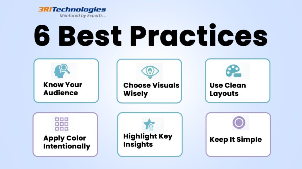
10 Data Visualization Best Practices
1. Know Your Audience Before Creating Visualizations
When developing a visualization, always start by identifying your audience. The way you present data to a data scientist differs greatly from how you’d share it with a marketing manager. For example, a scatter plot may work well for technical users who want to analyze correlations, but a pie chart or bar chart might be more suitable for stakeholders who need quick takeaways. One of the most crucial data visualization lessons that any quality Pune data visualization school will teach is this one.
Whether you’re creating dashboards, infographics, or business reports, the audience’s data literacy and objectives should guide your design. If you’re targeting beginners, avoid cluttered visuals or excessive metrics. Use simplified data visualizations that highlight insights clearly. This method promotes data-driven decision-making in addition to increasing user engagement. Long-tail keywords like how to make visualizations easy for business users are highly relevant here.
Example:
A retail dashboard for executives might use a bar chart to show top-selling products rather than a dense table of numbers.
2. Choose the Right Chart Type for Your Data
One of the core 10 data visualization best practices is selecting the correct chart type. Using the wrong one can confuse your audience and distort your message. If you’re showcasing sales trends across months, a line graph offers a clear view of the progression. For comparing regional sales figures, a bar chart works better. For distribution patterns or relationships, opt for a scatter plot.
Enrolling in a Data science course in Pune can help you master which visuals work best for which data type. While creating visualizations, always ask: “What story does my data tell, and what’s the best format to communicate that?” Long-tail keywords like best chart type for comparing data over time are highly searched and add contextual strength to your blog.
Example:
To show demographic distribution, a company used a map visualization with colour gradients, making regional trends instantly visible.
3. Simplify the Design
Simplicity is one of the golden rules in data visualizations. Users may become overwhelmed by a chart that is too packed with colors, labels, and objects. Creating visualizations that are clean and focused ensures better readability and retention. Remove 3D effects, excessive gridlines, and unrelated data points.
Professionals learning through a data analytics course in Pune often practice refining visuals by stripping unnecessary elements. Use white space strategically and highlight only the most relevant metrics. Simpler charts not only load faster in dashboards but also improve user engagement on mobile and desktop.
Example:
A financial report swapped a 3D pie chart with a clean bar chart, resulting in a 40% increase in report comprehension during stakeholder meetings.
4. Use Colors Strategically
Colour enhances the storytelling power of data visualizations—but only when used correctly. While too few hues might be confusing, too many can be distracting. Use a consistent color scheme and apply colour to highlight comparisons or differences. Tools taught in Data Visualization classes in Pune often include colour theory as part of effective data visualization tips.
Colour also helps with user experience. For instance, red and green can denote negative and positive changes, while gradients can show intensity. Consider accessibility by using colourblind-friendly palettes.
Example:
A marketing dashboard used a red-green colour scale in a line graph to show underperforming vs. overperforming campaigns, making performance gaps easier to spot.
5. Label Clearly and Provide Legends
Proper labelling helps viewers instantly understand your data visualizations. Each data point, legend, and axis has to have a legible name. Ambiguity leads to misinterpretation, which undermines the purpose of your visual.
This is why creating visualizations with labelled axes, units, and meaningful titles is heavily emphasized in any data analytics course in Pune. Use readable font sizes and place legends close to the charts. When necessary, use tooltips or annotations for extra clarity.
Example:
In a scatter plot used for showing user behaviour, adding a legend with clear markers (e.g., returning users vs. new users) boosted insight accuracy during a product presentation.
6. Maintain Data Integrity
Always represent data honestly. This entails avoiding cherry-picking data points, adjusting scales, or cropping axes in order to promote a biased narrative. Ethical data visualizations are key to building trust, especially in business and academic reporting.
A bar chart that begins the Y-axis at 50 rather than 0 might, for instance, exaggerate differences. This misleads viewers and damages credibility. In developing a visualization, be transparent with the methods, sources, and intent.
Example:
A sales report once cropped its line graph to exaggerate growth, which led to confusion and misreporting during a quarterly review.
7. Emphasize Important Findings
Stressing the takeaway is one of the most often ignored data visualization strategies. Use annotations, highlights, and bold colors to direct attention to the insight that matters most.
Creating visualizations that guide interpretation leads to more efficient decisions. In platforms like Tableau or Power BI (often taught in Data Visualization training in Pune), you can use data callouts or conditional formatting to highlight key patterns.
Example:
In a map showing COVID-19 cases, red circles were added to regions with high counts, helping policymakers prioritize health responses.
8. Scale Your Axes Correctly
Improper scaling can distort reality. For instance, a bar chart showing 90 and 95 may look like a massive difference if the Y-axis starts at 85. Scaling must match the range and nature of the data.
Always use consistent intervals and avoid truncated axes unless justified. This practice ensures your data visualizations are truthful and easier to interpret. It’s also a strong ethical standard promoted in many Data science and visualization courses in Pune.
Example:
An HR dashboard adjusted its line graph scale to start at 0, offering a more accurate view of employee attrition trends.
9. Ensure Accessibility
Your data visualizations should be readable and inclusive for all audiences. This includes using colourblind-friendly palettes, adding alt text for screen readers, and choosing legible fonts.
These days, accessibility is a major consideration when designing online and workplace dashboard visualizations. Courses like accessible data visualization training in Pune emphasize that inclusive design not only improves UX but also boosts your SEO and brand credibility.
Example:
A UX team redesigned their bar chart dashboard using high-contrast colors and tooltips, improving comprehension among colourblind users.
10. Test and Iterate
After developing a visualization, share it with a sample group. Gather feedback on clarity, relevance, and impact. Often, what looks good to the designer might be confusing to the end user. Iteration is key to great data visualizations.
Use A/B testing or surveys to see which version performs better. This approach aligns with long-tail keywords like how to improve your data visualizations over time and is core to any advanced data visualization course in Pune.
Example:
A company A/B tested two line graphs showing revenue. The version with data callouts and trendlines received 60% more engagement from stakeholders.
What Comes Next? By applying these Data Visualization best practices, you can stay ahead when creating clear, meaningful, and impactful visuals. To strengthen your skills even further, explore our related guide that shares practical tips for designing dashboards that users genuinely enjoy using and understanding.

Conclusion
Gaining proficiency in the art of visualization is crucial in the data-driven world of today. You can turn unstructured data into captivating visual narratives that spark ideas and affect choices by adhering to these ten data visualization best practices. Whether you’re working with a simple bar chart, an insightful line graph, or an interactive map, the goal remains the same—clarity, accuracy, and purpose.
From understanding your audience to choosing the right chart type, using colors wisely, and ensuring accessibility, each step plays a vital role in developing a visualization that is both effective and ethical. These practical data visualization tips are not just for designers or analysts—they are for anyone looking to make data meaningful.
Consider signing up for a practical Job Oriented course in Pune if you want to hone your abilities even further. It’s the perfect way to gain real-world experience, learn industry tools, and elevate your ability to communicate data with impact.
Great data visualizations don’t just show numbers—they tell stories that matter.
FAQ
1. What is data visualisation, and what role does it play in data science?
The technique of visualising data using dashboards, graphs, and charts to make information clear is known as data visualisation. In Data Science, strong Data Visualization helps Data scientists and data analysts explain insights clearly, support decision-making, and communicate complex Data Analysis results to non-technical stakeholders.
2. How does Data Analysis differ from Data Visualization?
Data Analysis focuses on collecting, cleaning, and examining data to find patterns and insights, while Data Visualization presents those insights visually. Both skills work together and are essential for learners who want to learn about data science and prepare for real-world Data Science job roles.
3. Do I need coding skills to learn Data Visualization and Data Analysis?
To begin with data visualisation and data analysis, a basic understanding of coding is useful but not required. Many tools allow beginners to create visuals without heavy coding. However, learning Python or SQL as part of a structured Data Science Curriculum in Pune can significantly improve career opportunities for Data scientists and data analysts.
4. What Data Science job roles require strong Data Visualization skills?
Data Visualisation serves a major role in a number of Data Science job roles, such as Analytics Consultant, Business Analyst, Data Scientist, and Data Analyst. Particularly in analytics and AI-driven organisations, employers demand specialists to transform raw data analysis into clear visual reports that inform business choices.
5. Is a Data Science Certificate in Pune helpful for building Data Visualization skills?
Yes, a Data Science Certificate in Pune provides structured learning in Data Visualization, Data Analysis, and real-world projects. Such certification programs help learners understand industry tools, best practices, and practical use cases, making them job-ready and competitive in the analytics field.